We’ve been running our new banner for a couple of weeks now, and if you look you’ll see that the URL is different for our school banner than our website. Why? It’s in Chinese!
Today’s post looks at whether your site is mobile ready, and how to do it. The mobile web is beginning the growth phase and could be even bigger a phenomenon than the current web, as the number of mobile units out in the market, many of which are mobile internet ready, is huge!
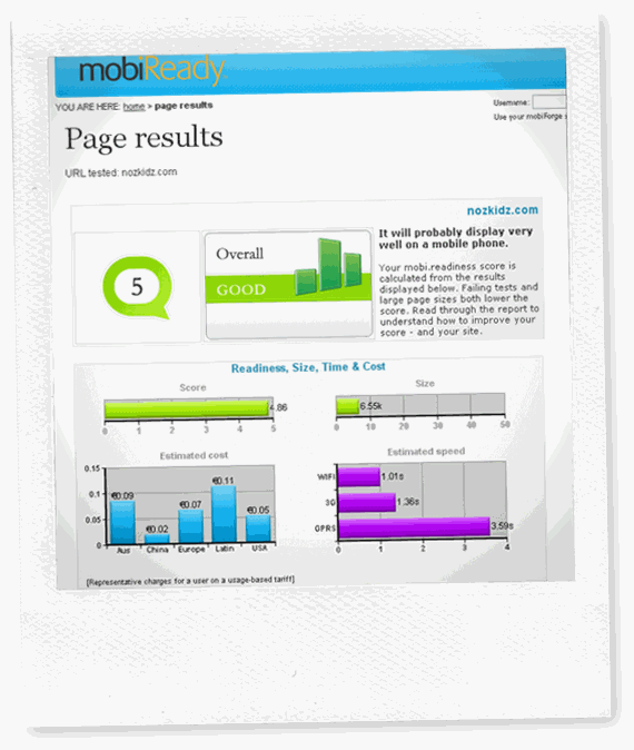
The results are pretty good, too, if you take a look.
 Of course, this is fortuitous because it means I can figure out if people are actually seeing the sign in our target area and visiting our site from the URL or not. But the risk is if you are on the street, and you want to check the details before you call, and your site isn’t mobile you’ll likely discourage the visitors because of what they might see.
What do they see when they get there? Well, before they would have seen a busy site in mini-view with lots of places to click, and not suited to the mobile experience at all. But I installed one plugin called WordPress Mobile which …
WordPress Mobile Edition
A mobile/phone/PDA friendly interface for your blog with progressive enhancement for advanced mobile browsers.
This is a combination theme and browser checker that delivers a mobile view if one of the user agents matches the list of mobile browsers. With so many mobiles out there, the list of browsers is quite diverse, but the user experience is great.
Once you install the WordPress Mobile Edition, and activate it, it’s pretty smooth. You can test your site at Ready.Mobi to see if it is compatible.
The stats are meaningless without taking a screenshot of the site in mobile view, but that’s a little tricky! Any suggestions how to get a pc to view a mobi.site? Are you a mobi developer? Do you have a mobile site? Do you have a regular site and are you getting it ready for the mobile world?
